Picklr
Designing a court booking and community app for pickleball players.
PROMPT
Design a 0-to-1 mobile application by identifying a user group with underexplored needs (excluding students) and conducting needfinding research to uncover opportunities for intervention.
Picklr is a mobile app that helps pickleball players find courts, book games, and connect with their local community. The app addresses the coordination challenges of spontaneous play through real-time availability, streamlined booking, and organized community features.
I selected pickleball players as my user group because I personally experienced recurring coordination issues while trying to find open courts and organize games. This firsthand exposure highlighted a clear gap and motivated me to explore whether other players faced similar unmet needs.
Pickleball players waste time and miss games due to poor coordination.
Pickleball's popularity has created a coordination problem. Players arrive at courts only to find them full, singles players can't find partners for doubles, and league information is scattered across Facebook groups.
PROJECT GOAL
How might we help pickleball players to easily discover open courts and organize games without the usual confusion or back-and-forth planning?
Observing Real Behavior
I observed ~15 players at peak hours and analyzed San Diego pickleball Facebook groups to understand real coordination behavior before designing any solutions.
RESEARCH METHODS
- ~15 players
- Peak hours
- San Diego Pickleball
- Facebook groups
KEY INSIGHTS
- Players arrived to full courts
- First-come systems caused frustration
- Players actively asked to join games
- Doubles were organized informally
- Facebook posts focused on flyers
- Real-time game info was hard to find
SYNTHESIZED USER NEEDS
- Know court availability before making the trip
- Communicate about games and find partners easily
- Centralized space for leagues and events
Brainstorming Through Exercises
I explored solutions using mind mapping, challenging assumptions, and reverse thinking. These exercises helped find and cluster opportunities around availability, coordination, and community, which guided feature prioritization and early lo-fi sketches.
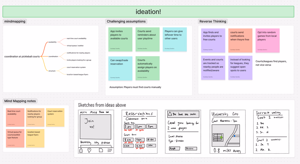
mind mapping — explored and grouped ideas around availability, coordination, and structure.
challenging assumptions — questioned the idea that players must manually check courts to find open play.
reverse thinking — reframed coordination so courts and systems initiate matches instead of players.
These exercises directly shaped three core features: real-time court availability on the map, a social tab for partner finding, and a waitlist system for reservation management.
During in-class critique sessions, peers pointed out that availability alone wouldn't fully solve spontaneous play. Based on this feedback, I explored more social features that help players find partners in real time without turning the app into a social network.
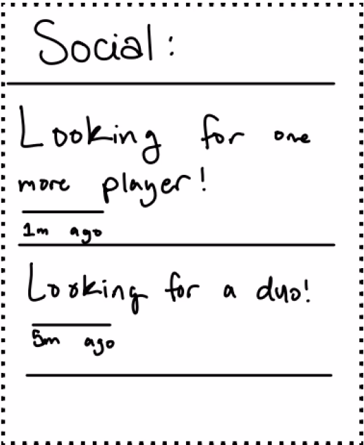
social tab — community posts for finding partners and open games
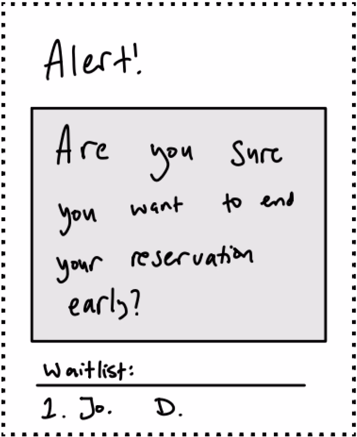
reservation alert — early exit confirmation with waitlist handoff
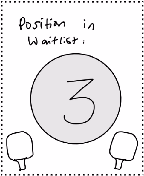
waitlist status — visual position indicator for court queue
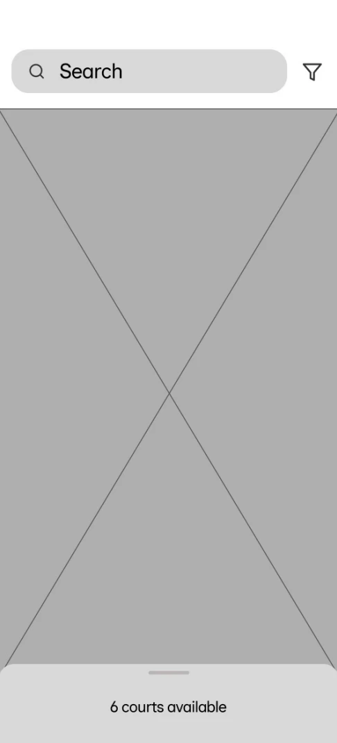
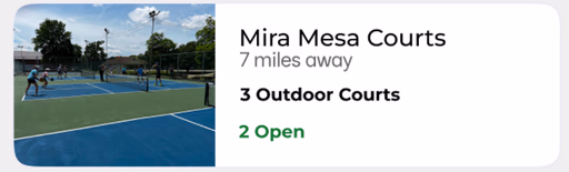
court map — real-time availability with count indicator
From these explorations, I structured the app around 5 main tabs: Home (Map), Bookings, Social, Saved, and Profile — prioritizing real-time availability, QR check-in, event discovery, and community coordination.
Mid-Fidelity
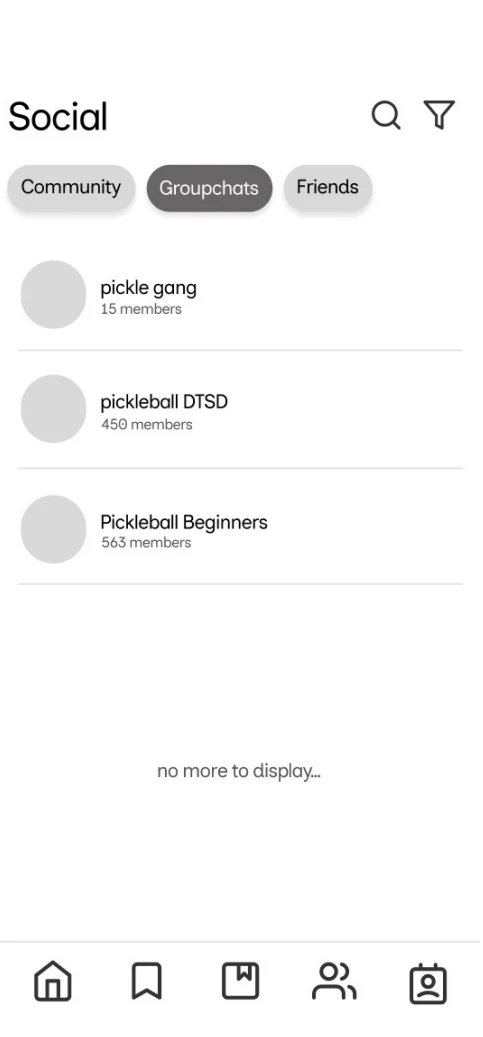
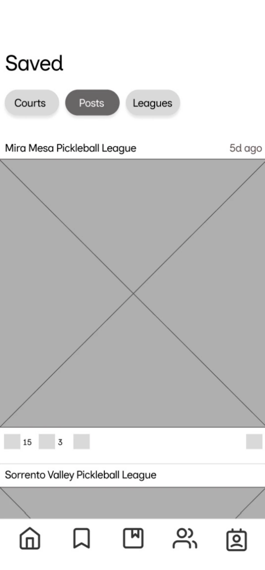
Further development of Home, Social, Bookings, and Saved tabs. During critique sessions, I raised concerns about the ‘Saved’ tab as I felt there wasn't enough content to justify having a dedicated tab. After discussing with peers, I consolidated saved courts, posts, and leagues into the Profile section, reducing the navigation from 5 to 4 tabs. This eliminated a tab with insufficient content and reduced decision fatigue for new users.
Usability Testing
Given a 10-week timeline, I conducted focused usability sessions with 2 participants to evaluate the booking flow and overall experience.
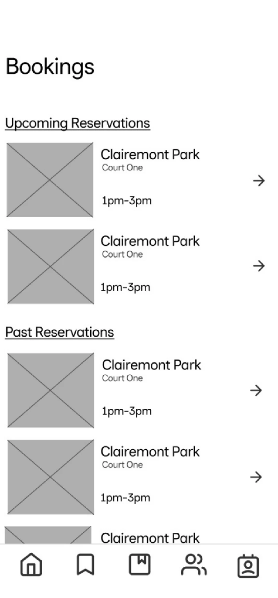
Tasks: Book a court, cancel reservation, write review
USER INSIGHT
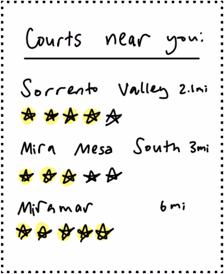
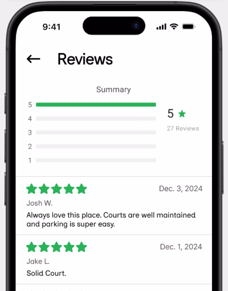
“I thought I could tap the stars to see what other people said.”
Participant 1, usability session
Reviews Discoverability
Problem: Users expected the star rating to be interactive but couldn't access existing reviews.
Solution: Linked the rating to a reviews section while keeping review creation limited to completed bookings.
Navigation Clarity
Problem: Users weren't sure how to start a booking and expected more than one entry point.
Solution: Added multiple paths to court details from the Map, Bookings, and Community tabs.
Finding Past Bookings
Problem: Users had difficulty locating specific past reservations.
Solution: Added a search icon to filter bookings more efficiently.
High-Fidelity
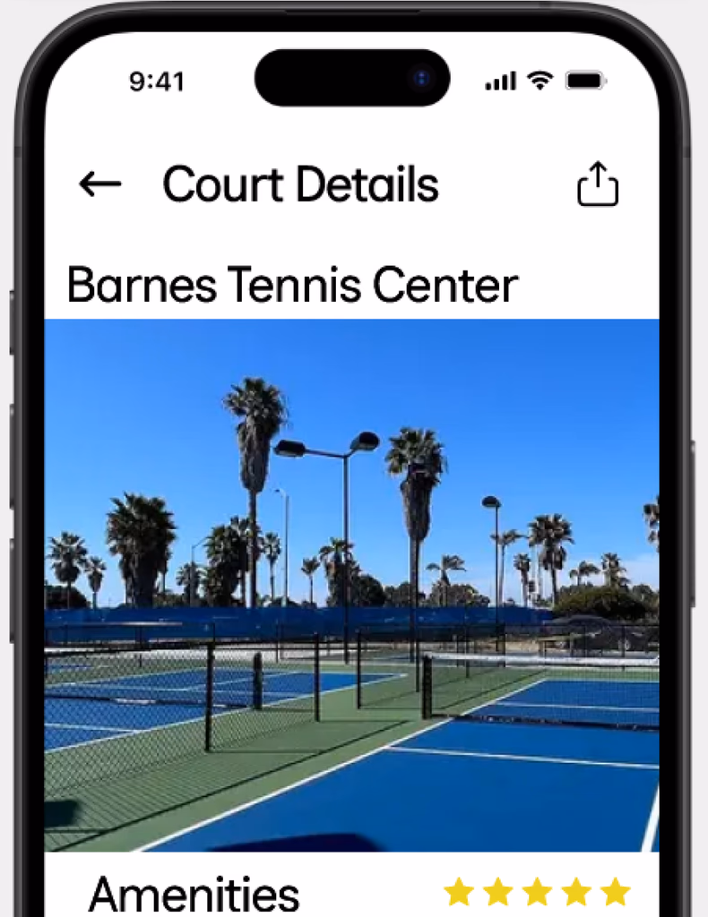
Court Discovery & Booking
Browse nearby courts with real-time availability and book in seconds.
Game Invitations
Get notified when players need one more person and join their game with one tap.
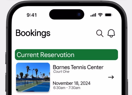
Active Reservation Management
End your reservation early and release the remaining time to players on the waitlist.
Reflection
SMALL CHANGES, BIG WINS
Adding a search icon to the Bookings tab took minutes but solved a real pain point for frequent users. The best design improvements are often the simplest. You just have to listen to where users are struggling.
FEEDBACK AS FUEL
Weekly critiques taught me to articulate decisions before I felt ready and stay open to change. The pivot from 5 tabs to 4 came from peer feedback. The social features expanded because a classmate asked “what happens when you show up to a court and don't know anyone?”