Case Study Hero Placeholder
A Happier Me
Designing a wellbeing app to empower Vietnamese youth through mindfulness and social-emotional learning.
THE OPPORTUNITY
A Happier Me runs ‘Wellbeing Circles’ — in-person mindfulness programs for Vietnamese youth. In a design practicum course, our team partnered with A Happier Me, a Vietnamese social enterprise, to extend their in-person mindfulness programs into a mobile app for youth facing mental health stigma.
I conducted UX research and designed the complete daily check-in experience, focusing on the mood selection interface and mindful breathing flow. I also conducted 4 usability tests improving task completion from 60% to 100%, performed competitive analysis of mental health apps, wrote UX copy using non-clinical culturally sensitive language, and built interactive prototypes in Figma for usability testing and client delivery.
The Challenge
The previous team's prototype didn't align with brand guidelines and lacked cultural appropriateness. We were tasked with redesigning from scratch while navigating a complex cultural context. Mental health in Vietnam carries deep stigma, and we couldn't access our actual target users for testing.
14 Million
People needing mental health care in Vietnam
In 2023, about 14 million people suffer from mental disorders in Vietnam
143
Total clinical psychologists and psychotherapists
In 2023, the country only has 143 clinical psychologists and psychotherapists available (4 per 100,000 vs US's 30+)
4x
Higher risk for low-income youth to have poor mental health
Youth from poor households are 4x less likely to have good mental health, yet least able to afford care
Cultural stigma compounds the structural problem:
Cultural Stigma
Mental illness seen as 'punishment from ancestors' — families feel shame, parents dismiss children's struggles
Economic Barriers
Western apps ($10-15/month) and therapy remain unaffordable for those who need it most
Education Gap
No mental health curriculum means youth lack vocabulary to describe or process their emotions
Access Problem
143 psychologists for 14M people, concentrated in urban areas with long wait times
Defining the Goal
PROJECT GOAL
How might we create an app that makes mindfulness accessible within Vietnamese cultural context while also enabling wellbeing practices without requiring professional intervention or exposing vulnerable users to stigma?
Navigating the Constraint
The biggest challenge: we couldn't travel to Vietnam to interview actual users. This created risk of cultural misunderstanding and assumptions. To mitigate this, my team honed in on multiple research methods and leaned heavily on client expertise.
- Phuong Anh Nguyen (Founder, A Happier Me) via email — organizational vision and cultural context
- Dr. Kaitlyn Saulman (UCSD Psychologist) via Zoom — clinical best practices for youth mental health
- University student in-person — end-user proxy for pain points
| App | Problem | Solution | Pros | Cons |
|---|---|---|---|---|
| Lack of mental health resource access | Evidence-based meditation, mindfulness, and therapy with guided support |
|
| |
| Overwhelming daily planning without realistic goals | Guided planning with timeboxing and app integration |
|
| |
| Static, non-interactive journaling | AI-powered reflective journaling with prompts |
|
|
Finding: Existing solutions require high financial commitment and aren't culturally contextualized.
Key Insights
“Guided meditations would be a good way to walk a person through a mindfulness exercise to help them through a thought process.”
From Dr. Saulman (UCSD Psychologist)
“A way to help folks feel more comfortable about depression which is a heavy clinical term can be instead phrased 'I am feeling sad.'”
From Dr. Saulman (UCSD Psychologist)
“I feel like mental health resources are not as accessible as they should be. Many people have difficulties getting appointments.”
From Sanya K. (UCSD Student)
“The previous team's website prototype was good, the users feedback was positive. The app was not usable as little has been done.”
From Phuong Anh Nguyen (Founder, A Happier Me)
These insights shaped our core design decisions. Our app needed guided mindfulness exercises using approachable, non-clinical language instead of terms like ‘depression’ or ‘therapy.’ The real barrier wasn't desire for mental health support, it was accessibility and cost. With the previous team's app being unusable, we had to start fresh and prioritize usability from the ground up.
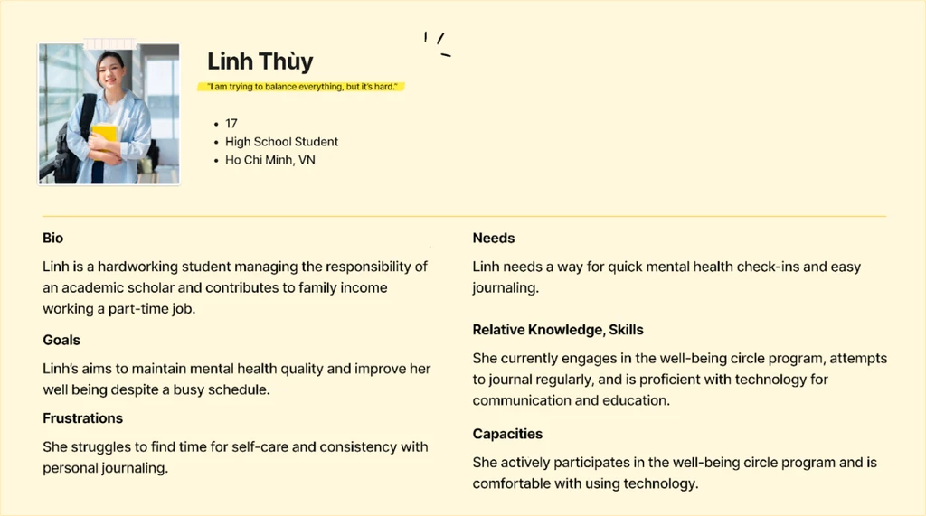
User Persona
From our research, we created Linh Thuy, 17, student in Ho Chi Minh who embodies our target user:
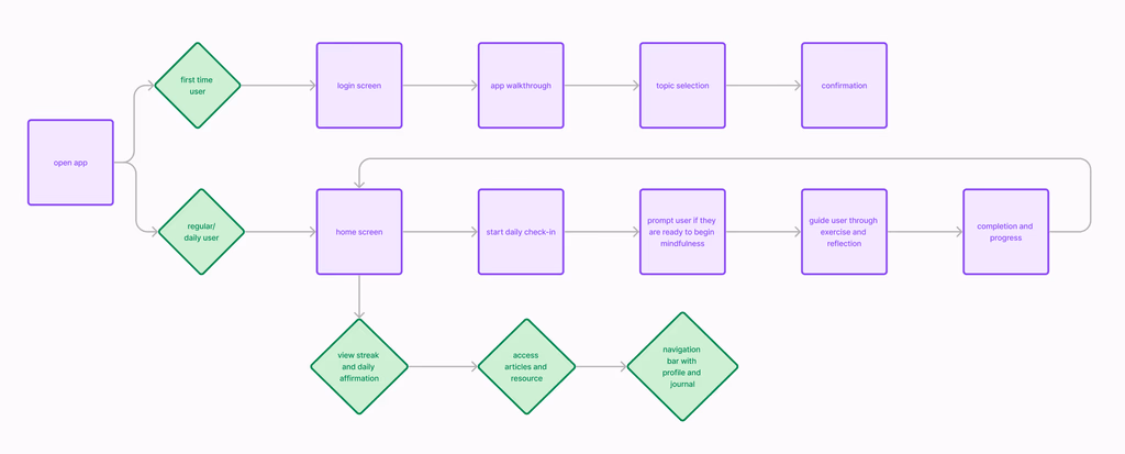
Mapping Structure and Flow
My team and I mapped the user journey to establish two distinct paths: first-time users needed onboarding and topic selection, while returning users required quick access to their daily check-in.
User Flow
Low Fidelity Wireframes
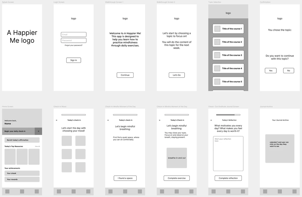
We identified two key paths: first-time users needed onboarding and topic selection, while returning users required quick access to start their daily check-in. The wireframes established a linear progression (mood → activity → journal).
Exploring Three Visual Directions
We then explored three distinct approaches to find the right balance between professionalism and approachability for Vietnamese youth:
Option 1: WellbeingWorks
(Professional Minimalism)
Inspiration: Slack, Google Workspace
STRENGTHS
- Clean lines reduce cognitive load
- Professional aesthetic builds trust and credibility
- Clear task hierarchy keeps users focused
LIMITATIONS
- Generic appearance may feel less personable for youth
- Less encouraging tone compared to other options
Option 2: Glow UP
(Gen-Z Focused)
Inspiration: Snapchat, Reflectly
STRENGTHS
- Vibrant colors grab attention
- Interactive text encourages engagement
- Emojis and trends resonate with target demographic
LIMITATIONS
- Could alienate users outside 13–22 age range
- Trend-dependent design could date quickly
- Could exclude older users who still need support
Option 3: A Happier Me
(Culturally Grounded)
Inspiration: A Happier Me's brand guidelines
STRENGTHS
- Balances approachability with credibility
- Welcoming space for emotional expression
- Works across full 10–30 age range
LIMITATIONS
- Multiple colors could become distracting if not carefully balanced
- Requires careful consistency in button/header styling
Choosing the Direction
Decision Matrix
My team and I evaluated the three directions using weighted criteria based on project priorities. Scores represent relative strengths against A Happier Me as the baseline: +1 (stronger), 0 (neutral), -1 (weaker).
| Concept | Usability (3×) | Desirability (2×) | Cultural (2×) | Feasibility (1×) | Total |
|---|---|---|---|---|---|
| WellbeingWorks | 0 | -1 | +1 | +1 | -1 |
| Glow UP | 0 | +1 | -1 | 0 | 0 |
| A Happier Me | 0 | 0 | 0 | 0 | 0 |
THE DECISION
While ‘A Happier Me’ and ‘Glow UP’ tied at 0, we selected ‘A Happier Me’ because the client wanted stronger brand alignment while still incorporating the engaging elements (emojis, encouraging copy) that made Glow UP appealing. This gave us the best of both worlds.
- Client Need: Brand guideline alignment was explicitly requested after the previous team failed to deliver
- Long-term Sustainability: Won't feel dated in 2–3 years like trend-dependent 'Glow UP'
- Versatility: Works across full 10–30 age range
First Iteration
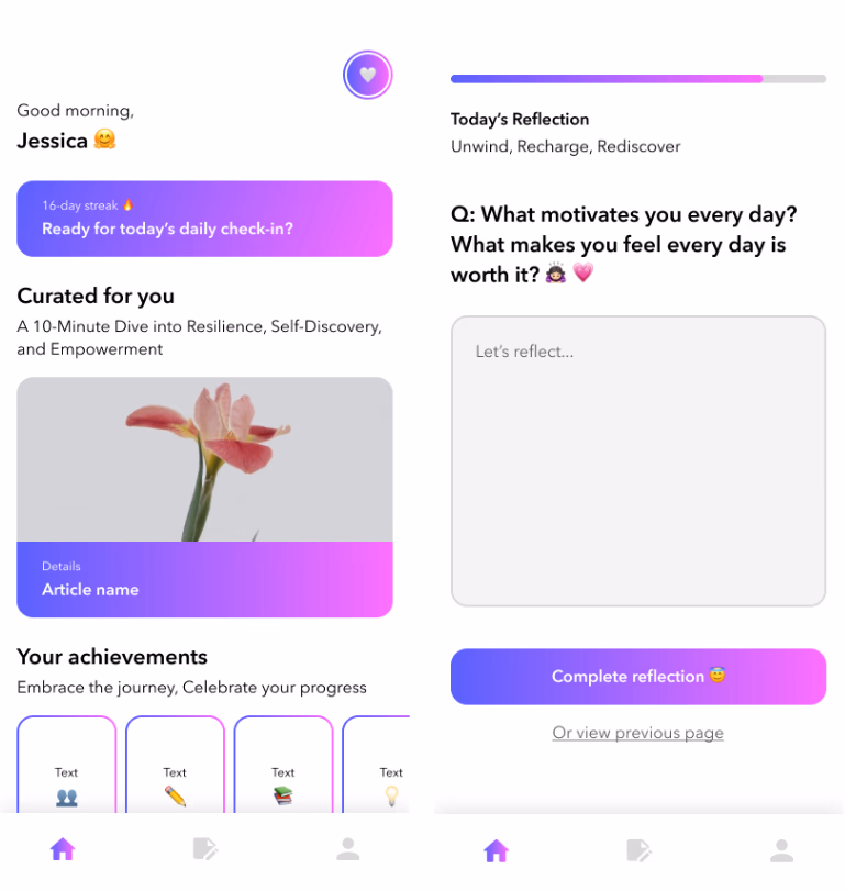
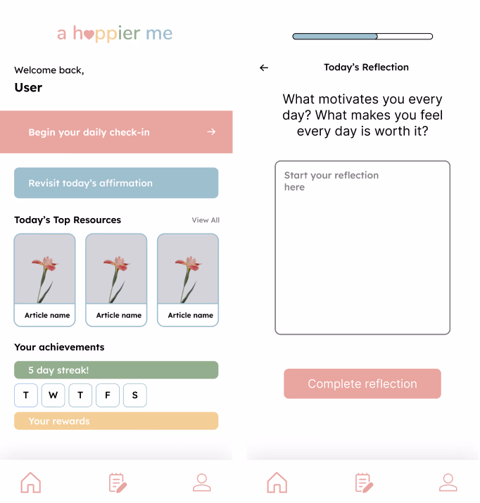
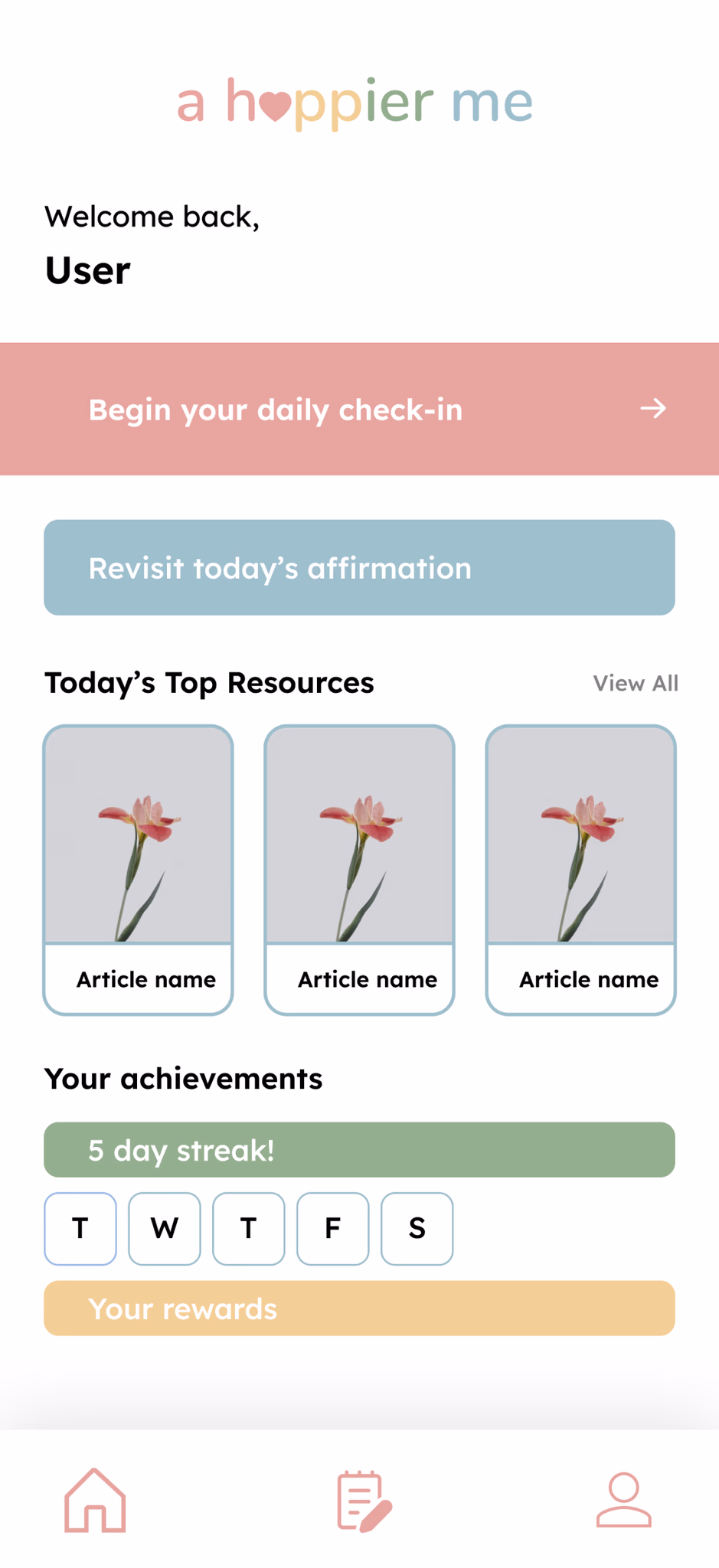
After selecting ‘A Happier Me,’ we designed the complete daily check-in experience using warm colors, rounded shapes, and non-clinical language to reduce stigma around mental health. Working with my team, I focused on designing the daily check-in flow — specifically the mood selection and mindful breathing sequences. We created three themed content days (mindful breathing, grounding exercise, gratitude reflection) to demonstrate how the weekly curriculum would rotate.
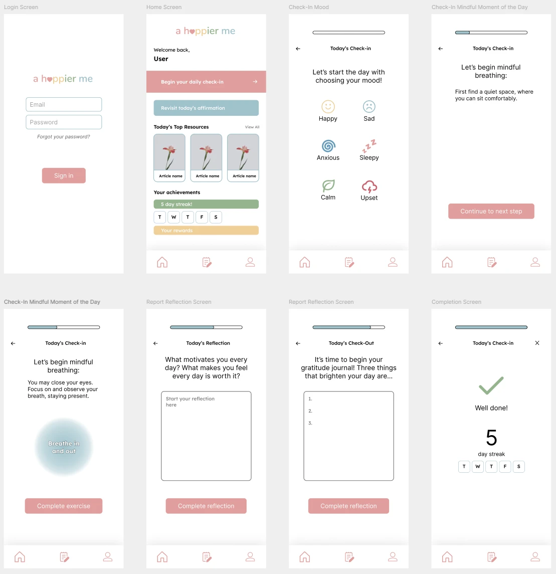
Usability Testing Changes
I conducted usability testing with 4 college students (ages 20–22) via Zoom. Based on their feedback, we made targeted iterations to improve clarity and consistency.
TESTING RESULTS
Initial results: Only 60% of participants could complete the flow without confusion or getting stuck.
Task completion improved from 60% to 100% after iterations.
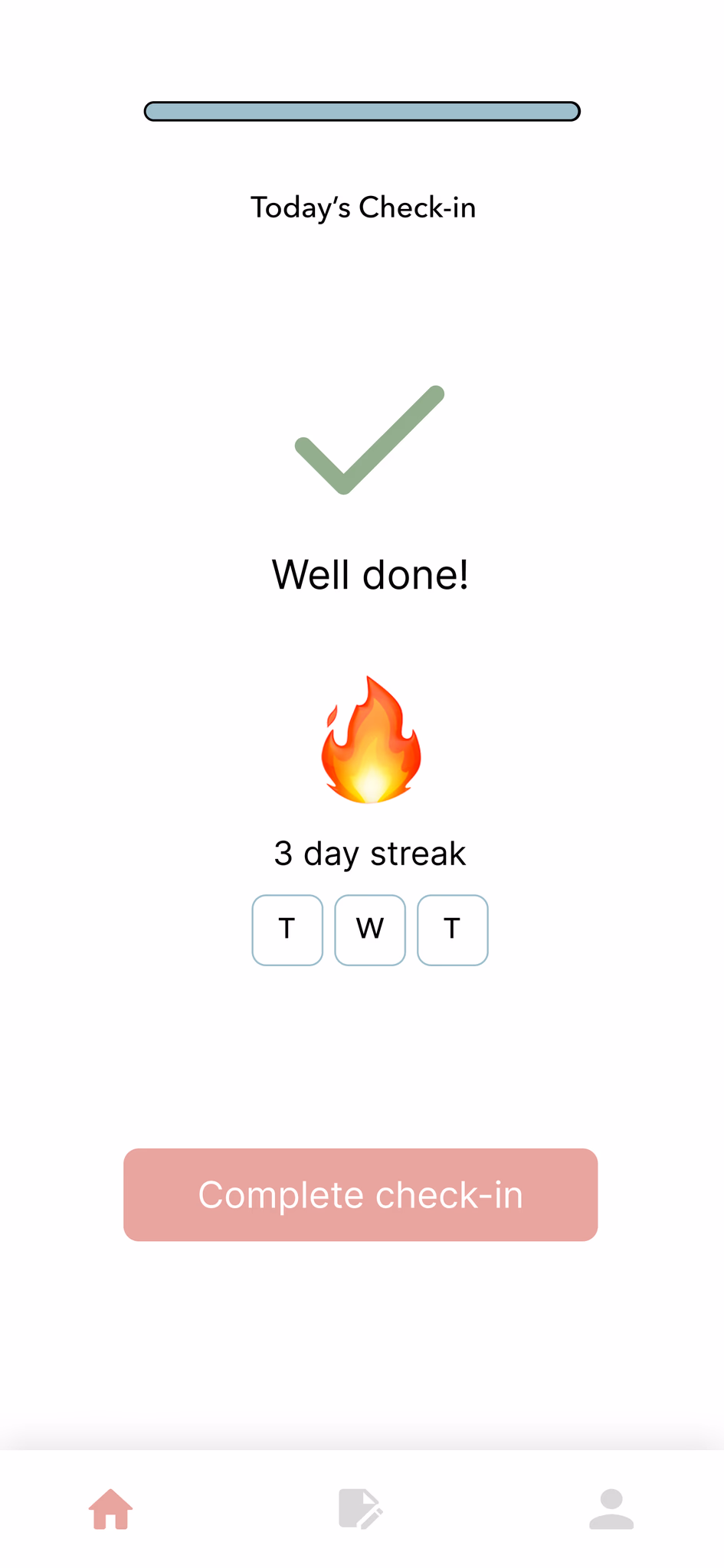
DECISION 1: HOME SCREEN RESTRUCTURE
“The home screen was overwhelming to look at because everything was clustered together — it took longer to process everything and break it down into smaller sections.”
— Nathanael
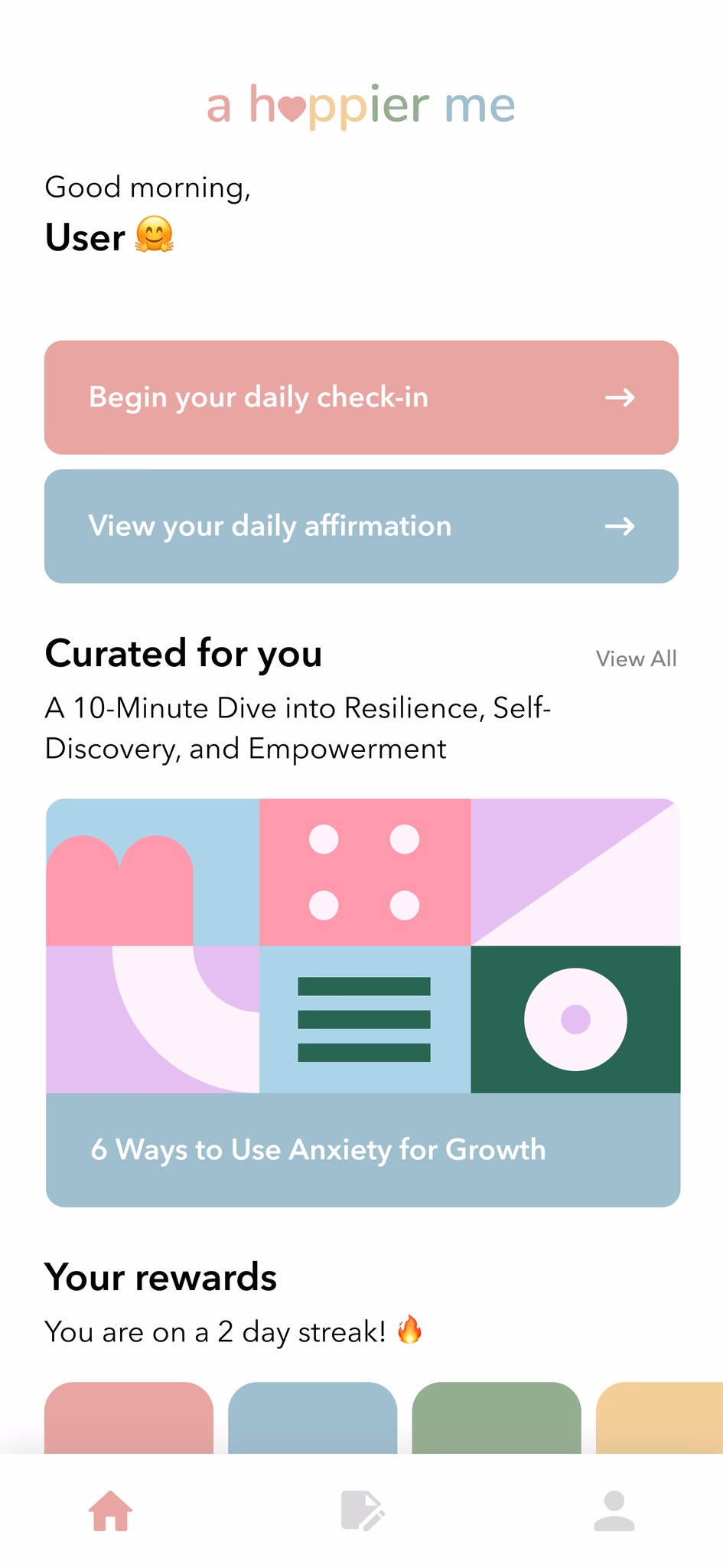
- Broke information into larger, distinct sections
- Used card-based containers to separate primary vs secondary features
- Applied whitespace to improve visual clarity
DECISION 2: EXIT FLOW CONSISTENCY
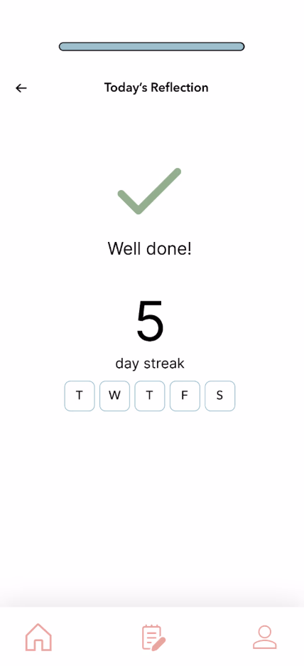
“I was thrown off by the lack of a button on the final streak page.”
— Nathanael
- Changed arrow to button similar to ones used throughout check-in
- Maintained consistent navigation pattern
- Aligned with mental model users developed during flow
DECISION 3: BREATHING EXERCISE CLARITY
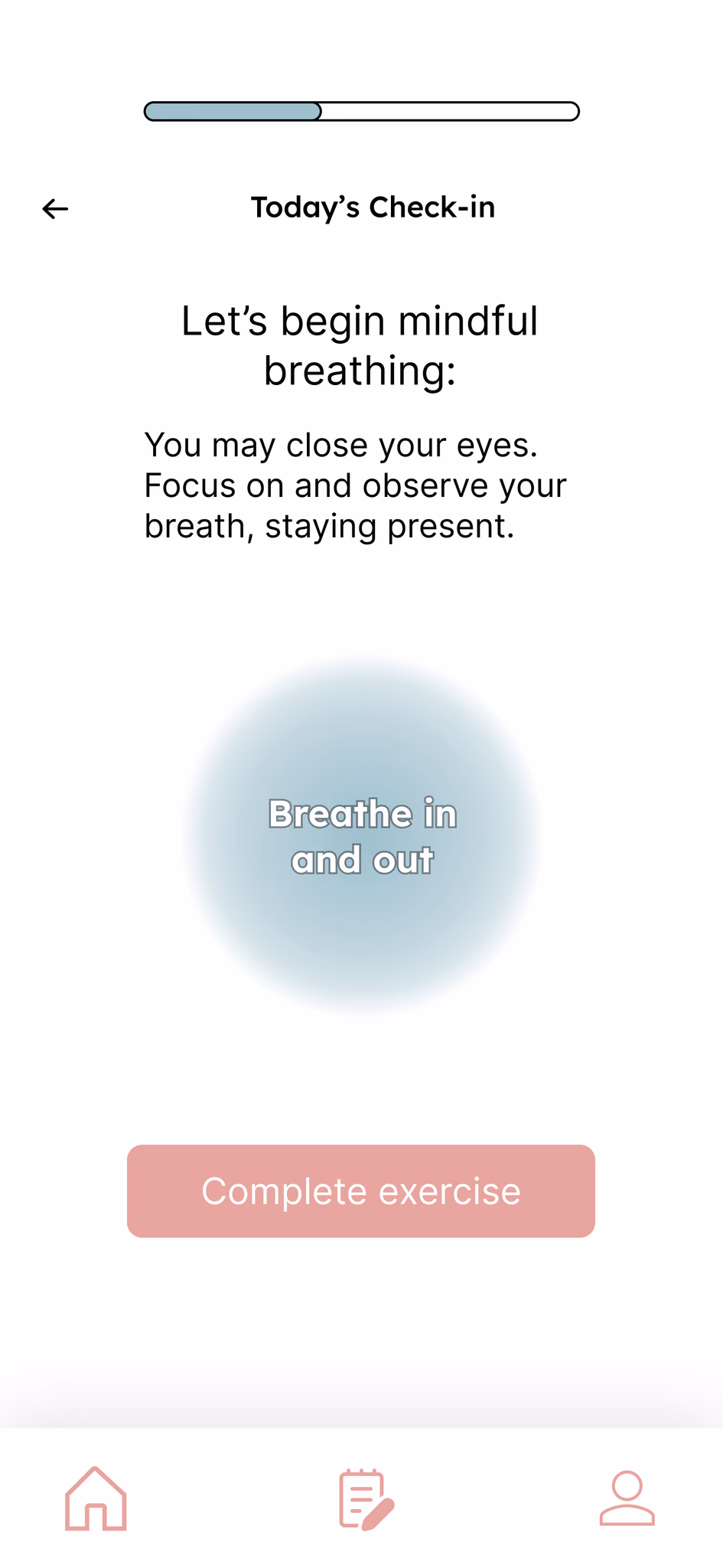
“I was confused about how long I was supposed to do the breathing activity — there was no clear beginning or ending.”
— Hannah
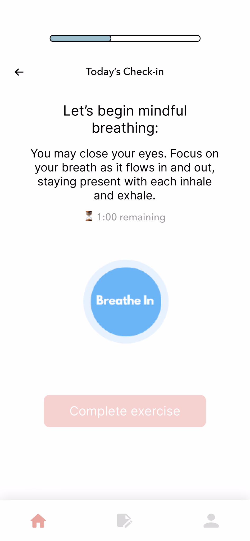
- Added animated GIF showing expanding/contracting motion
- Greyed out button until timer is over
- Added 1-minute countdown timer for clear duration
Test participants unanimously agreed the prototype was easy and intuitive to use due to its interface and simple directions. Participants noted the effectiveness of the activities' simplicity through encouraging mindfulness and self-reflection. Some expressed they could see themselves using the app regularly.
Testing Limitations: We interviewed UCSD students rather than Vietnamese youth due to access constraints.
Final Designs
We designed a rotating content system with three themed mindfulness exercises. Each day follows the same supportive structure: mood selection → guided exercise → reflection → gratitude → celebration, but teaches different techniques to build a comprehensive mindfulness practice.
Day 1: Grounding Exercise
Users connect with the present moment through breath and physical awareness of their connection to the ground, then reflect on the experience.
Day 2: Mindful Breathing
Users practice guided breathing with animated visual cues and a 1-minute timer. The expanding/contracting animation provides a clear focal point and pacing guide.
Day 3: Mindful Listening
Users practice focused listening to ambient sounds, guided by prompts that encourage present-moment awareness without judgment.
SIMPLICITY IS A FEATURE, NOT A COMPROMISE
Testing revealed that shorter sessions made the experience more approachable, not less meaningful. Designing for accessibility sometimes means doing less, not more.
CLEAR EXPECTATIONS ELIMINATE CONFUSION
Users assumed the breathing exercise was broken because they didn't know how long to wait. A countdown timer fixed it entirely.
PROJECT OUTCOME
The client approved the designs for implementation.
We delivered the complete design system, interactive prototype, and documentation to A Happier Me after the project. The client approved the designs for implementation with their development team.